Dashboard
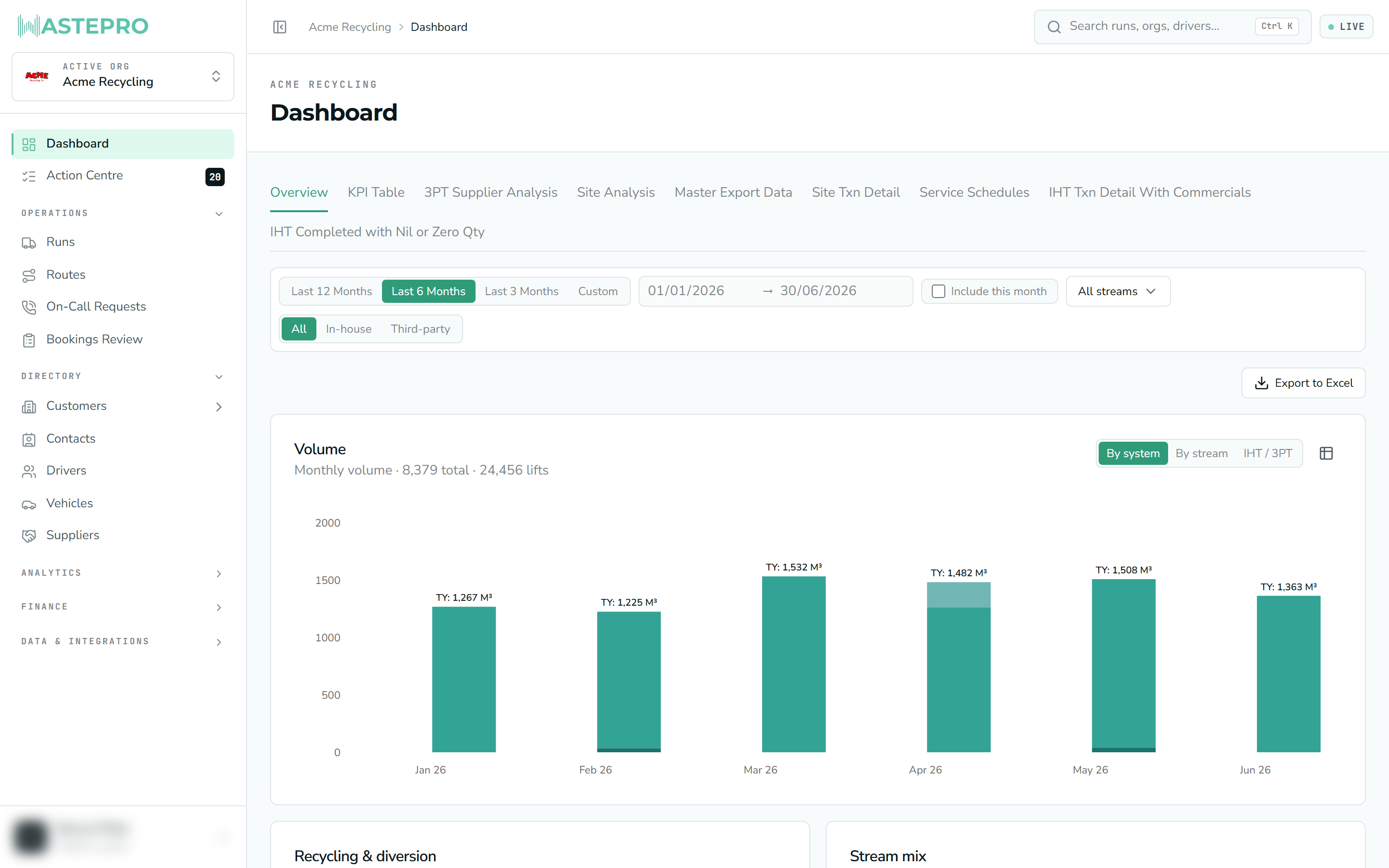
The Dashboard is your home screen — a single, at-a-glance picture of how much waste you’re moving, how it’s being recycled, who’s doing the work and where. It reads straight from your live data, so it’s always current.
It’s a thermometer, not a to-do list. The screen that tells you what to do next is the Action Centre.
What it’s for
Use the Dashboard to answer the everyday “how are we tracking?” questions without running a report: volumes up or down on last year, your recycling rate, how busy your runs are, and which sites and suppliers are carrying the load. Every number respects the filters at the top, so you can narrow it to a period, a waste stream or a type of collection and the whole page follows.
Choosing your period
The bar across the top controls the date range for the entire page.
- Last 12 / 6 / 3 Months — quick rolling presets. The page opens on the last 6 months by default.
- These presets count whole calendar months and, by default, exclude the current (part-finished) month so you’re comparing complete periods. Tick Include this month to add the month in progress.
- Custom — switch to your own From and To dates. Once you’re in Custom mode the two date boxes become editable; in preset mode they just show you the dates the preset resolved to.
The presets are deliberately month-based, so “Last 3 Months” means the three full months before this one — not the last 90 days. If the numbers look lower than you expect, check whether Include this month should be ticked.
Narrowing what you see
Alongside the dates, the same bar lets you focus the figures:
| Control | What it does |
|---|---|
| Material streams | Tick one or more streams (General Waste, Commingled Recycling, Paper & Cardboard, Food Organics, Other). Leave all unticked to include everything. |
| All / In-house / Third-party | Show every collection, only your own crews (in-house), or only work done by subcontractors (third-party). |
| Clear | Appears once you’ve applied a stream or model filter; resets them while keeping your dates. |
Reading the Overview
The main Overview tab is a set of cards, each with its headline figures in the subtitle and a chart beneath:
- Volume — monthly volume (in cubic metres) as stacked bars. Toggle between By system, By stream and IHT / 3PT, and switch to a table view. Each month also shows a light grey last-year bar beside it; hover any month for a this-year-vs-last-year breakdown with the variance.
- Recycling & diversion — the share of volume kept out of landfill, as a single recycling-rate percentage.
- Stream mix — how your volume splits across the waste streams.
- Execution — run hours and stops-per-hour over time, so you can see how hard your runs are working. (Shown only when there’s run data in the selection.)
- Exceptions — your most common futile (failed-collection) reasons, with a link through to resolve them.
- Who does the work — top drivers and subcontractors by job count, and the overall share that’s subcontracted.
Further down, the Overview also streams in Driver productivity, Supplier commercials, an Environmental impact summary and a Where the work happens map with your Top sites. These heavier cards load a moment after the rest of the page — that’s normal.
A Download button on the Overview exports the figures to an Excel workbook, with a separate sheet per card.
The other tabs
Above the cards are several tabs that mirror the fuller management reports:
- KPI Table and 3PT Supplier Analysis are built out — the KPI Table lays the headline measures out as a grid, and Supplier Analysis breaks down your third-party spend.
- The remaining tabs (Site Analysis, Master Export Data, and others) are placeholders that aren’t switched on yet, so they’ll say there’s nothing to show.
The Dashboard always relates to your active organisation, shown just above the title. If the figures look wrong, first check you’re in the right organisation — see Switching organisations.
Next: head to the Action Centre to clear the data problems that would otherwise stop jobs being billed.