Explore
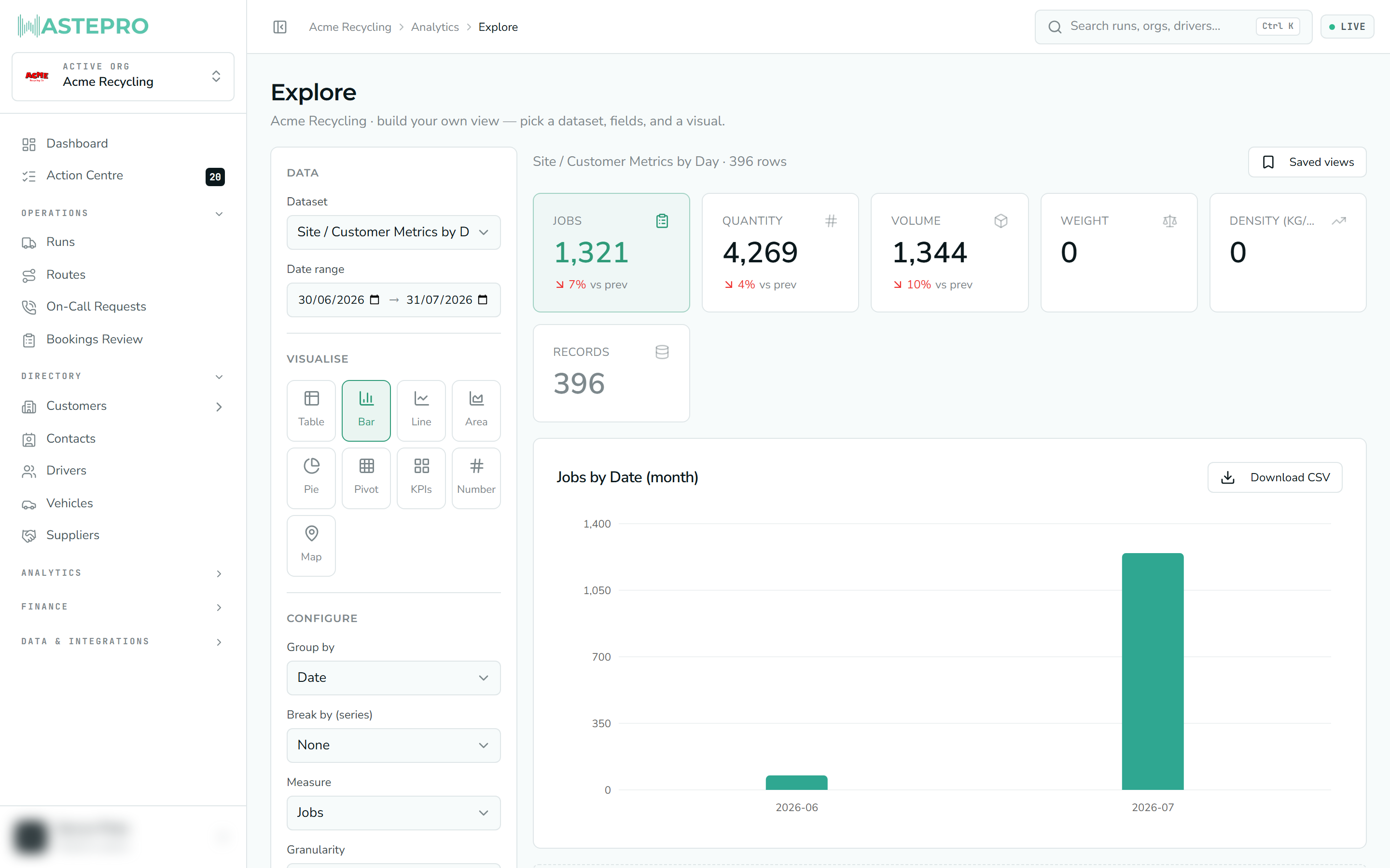
Explore is a free-form, build-it-yourself version of the reports. Instead of opening a ready-made report, you pick a dataset, choose how to slice it, and choose how to draw it — a bar chart, a line, a pivot, a single big number, and more. It’s for answering one-off questions that no fixed report happens to cover.
Explore is an optional feature and may not appear in your menu. If you can’t see Explore under Analytics, it hasn’t been switched on for your account — that’s expected, not a fault.
How it’s laid out
Explore has a builder panel down the left and the result on the right. Every time you change something on the left, the result on the right redraws.
Building a view
Pick a dataset
Choose which body of data you’re exploring — for example volumes and sites, exceptions (futiles and contamination), subcontractor metrics, or jobs by month. These are the same underlying datasets the fixed reports use.
Choose a visual
Table, bar, line, area, pie, pivot, a KPI strip, a single big number, or (for datasets that carry locations) a map.
Slice it
Set Group by (what to break the numbers down by), an optional Split by to layer a second dimension into the same chart, and the Measure (the number itself). When you group by date, a day / week / month / quarter control sets the time buckets.
Comparing and ranking
On a simple bar or line, a couple of extra options appear:
- Compare to prior period overlays the same length of time immediately before your range, so you can see the change.
- Benchmark draws a median or mean line across a ranked bar chart, and you can sort to put the biggest outliers first — handy for finding the sites or drivers that stand out from the pack.
Drilling in
On some datasets the chart is a hierarchy — customer, then site, then container, for example. Click a bar to drill in one level; a breadcrumb trail appears above the chart showing where you are. Click a crumb (or All) to step back out.
What it shares with the reports
Explore uses the same engine as the fixed reports, so the familiar pieces are all here: a date range, a KPI strip of exact totals with a change against the prior period, saved views you can name and share, and a CSV export on every view. The detail table and charts show the most recent 10,000 rows of a range; the KPI totals stay exact.
If a report you build in Explore turns out to be one you’ll want again, save it as a view rather than rebuilding it each time. See How reports work for the shared controls in full.
Next: for a purpose-built report rather than a blank canvas, look at Driver Productivity.