Brokerage / Subcontract analysis
This screen is where you check how your subcontracted (3PT) collections are performing — what each one earns you, what it costs, and whether the margin is what you expected. It reads your book the way you actually think about it: by customer, then site, then service.
You’ll find it under Analytics › Brokerage (3PT), where the app calls it Subcontract/Brokerage Analysis. Its in-house twin is IHT Analysis By Customer.
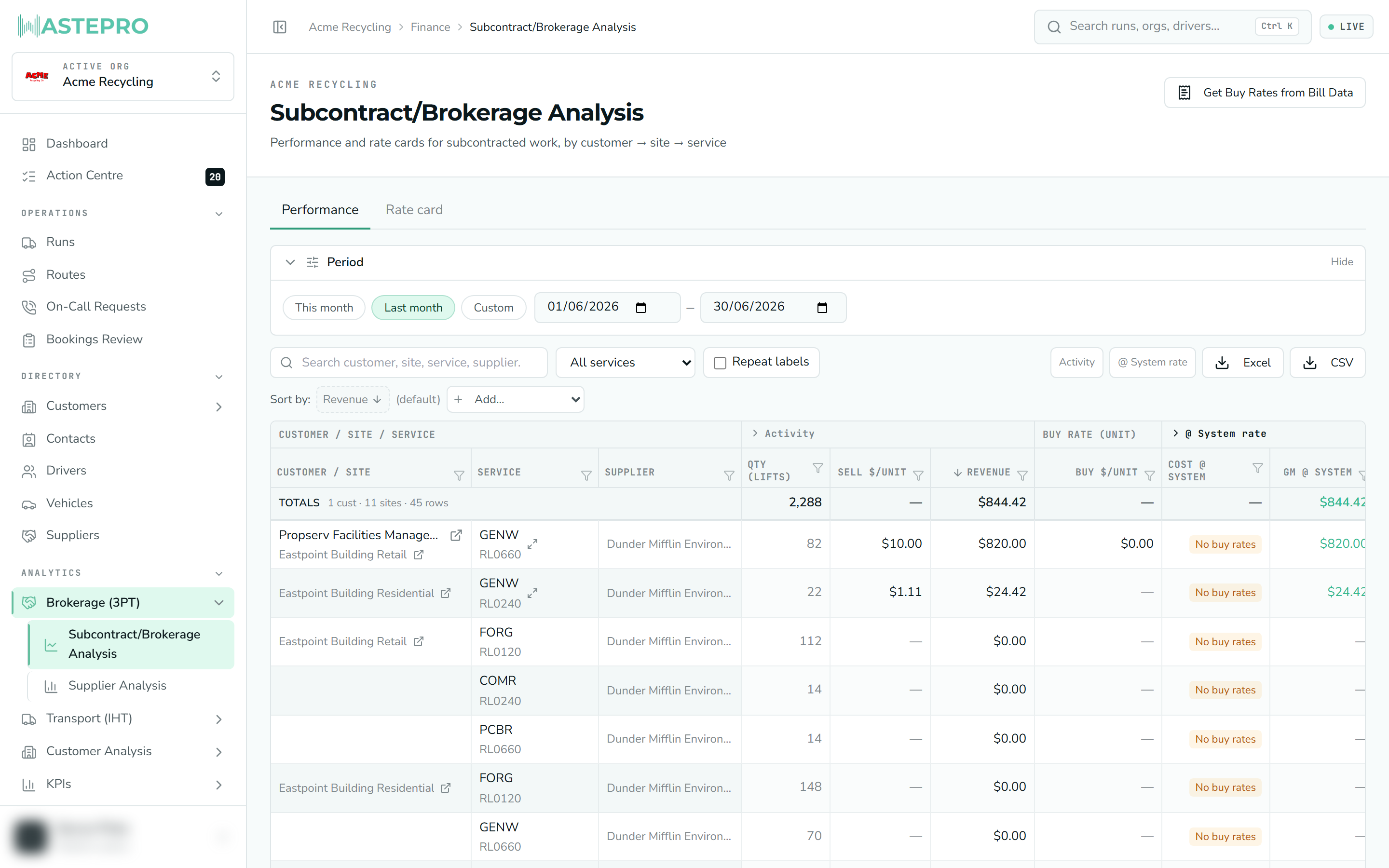
Use it when another company does the collection for you (brokerage / subcontracted work) and you want to see, across a period, which customers and sites are making or losing money — and whether your rate cards line up with what your subcontractors are really billing you.
What it’s showing you
Every row is one service at one site for one customer, over the period you’ve chosen. For each row the grid puts three numbers side by side so you can compare them at a glance:
- Revenue — what you charge the customer, worked out from your rate card’s sell price times the volume collected.
- Cost — shown two ways (see below): the cost your rate card predicts, and the cost your subcontractor actually invoiced.
- Margin (GM) — revenue minus cost. Where revenue is present, a healthy margin shows green and a loss shows red.
A row only earns revenue if the service has a sell rate on its rate card. Lines with no sell rate still appear (so you can see the activity and the cost), but they read as unpriced rather than as $0 of revenue.
The two ways cost is shown
This is the heart of the screen, and worth getting clear on. Cost appears under two tinted section bands:
| Band | What it means |
|---|---|
| @ System rate | The cost your rate card predicts — the buy price you’ve recorded, times the volume collected. This is what the job should have cost. |
| @ Billed value | The cost your subcontractor actually invoiced — the real numbers off their 3PT bill. This is what it did cost. |
Comparing the two is the point. When you expand the @ System rate section you get an Invoice vs rate column showing exactly how far the real invoice ran from your modelled cost — a plus means they billed more than your rate card expected, a minus means less. That’s your early warning that a rate card is out of date or a subcontractor has crept their prices up.
The columns
Columns are grouped into sections. The first three are frozen to the left so they stay put as you scroll across:
| Column | What it tells you |
|---|---|
| Customer / Site | Who you bill (top line) and where you collect (line below). |
| Service | The material stream and container for this service line. |
| Supplier | The subcontractor who did the work (with a count if more than one). |
| Qty (lifts) | Bin lifts serviced in the period. |
| Sell $/unit | Your rate card’s sell price per unit. |
| Revenue | What you charge the customer (sell × volume). |
| Buy $/unit | Your rate card’s buy price per unit. |
| Cost @ system | Modelled cost (buy × volume). |
| GM @ system / GM % | Modelled margin and margin rate. |
| Coverage | Share of the billed cost that carries a sell rate — how much of the row is actually priced. |
| Cost @ billed | What the subcontractor actually invoiced. |
| GM @ billed / GP % | Real margin and margin rate against the invoice. |
Some sections carry extra columns (like Job lines and Total qty) that stay hidden until you expand the section, using the small buttons at the top right of the grid. Hover any column heading to see a plain-language description and where the number comes from.
If a subcontractor has billed you for a service but you haven’t recorded a buy rate for it, the cost cell shows a “No buy rates” flag instead of a figure. That’s not a bug — it means the system can’t model that cost yet. Open the service (see below) and add the rate so the margin can be worked out.
Working the grid
The grid behaves like a spreadsheet, so you can slice it to answer a specific question:
Set the period
The Period bar at the top sets the date window for everything on the page. It defaults to the last complete calendar month (subcontracted bills arrive month by month). Collapse the bar once you’ve set it to free up space.
Search or filter
Type in the search box to find a customer, site, service or supplier. The quality dropdown gives you quick cuts — Losing margin, Missing buy rates, or Priced only — and every column has a funnel icon for its own filter.
Sort
Click a column heading to sort by it. Click again to reverse, and use Add… to chain a second and third sort (for example, biggest loss first within each customer).
Read the Totals row
A sticky Totals row sits under the headings and sums whatever you’ve currently filtered to, so the bottom line always reflects the view you’re looking at.
Fixing rates from here
Click a service in the grid to open its rate card in a pop-up editor — the same “Edit service” panel used elsewhere in WastePro. From there you can set the buy and sell rates, and the margin re-models against the period’s volumes so you can see the effect straight away.
There’s also a rate-card import action in the top-right of the page for pulling buy rates in from bill data, and a Rate card tab (next to Performance) that lays out every subcontracted site’s rate card grouped by customer and site for bulk review.
Editing rates here changes the live rate card for that service, not just this report. You’ll only be able to edit if your role includes rate permissions — if you don’t see the editor open, that’s why.
Things that are easy to misread
- Xero columns won’t always appear. If your organisation has a Xero connection that can read invoices, an @ Xero / AR status section shows each customer’s overdue and unpaid amounts live, with a red or amber flag on the customer name. No connection, no columns — that’s expected.
- The Xero figures repeat down a customer’s rows because they’re a customer-level fact. The Totals row is smart about this and counts each customer once, so the total isn’t inflated.
- Two exports, two jobs. The Excel button downloads the full detail (one row per invoice line) for the period; the CSV button downloads exactly the filtered and sorted view you’re looking at on screen.
Next: for the operational reports that sit alongside this one, see KPIs & Reviews.