How reports work
WastePro has a set of self-service reports for looking at your own data — volumes, weights, jobs, futiles, contamination and more. Every report shares the same handful of controls, so once you’ve learnt them on one report you know them all. This page explains those shared mechanics; the individual report pages then only have to tell you what that particular report is about.
Reports are read-only. Nothing you do here changes your data — you’re only looking at it, slicing it, and exporting it. Filtering, grouping or exporting can’t break anything, so explore freely.
Where the reports live
They’re all under Analytics in the sidebar, gathered into groups by subject rather than sitting in one long list:
| Group | Reports in it |
|---|---|
| Brokerage (3PT) | Subcontract/Brokerage Analysis, Supplier Analysis |
| Transport (IHT) | IHT Analysis By Customer, Driver Productivity Analysis |
| Customer Analysis | Site / Customer Metrics |
| KPIs | Volume Trend, Driver / Subcontractor Metrics, Job Metrics by Month |
| Reviews | Futile Jobs, Contamination |
Alongside them sit the two build-it-yourself tools: Self-Service Report Builder and, where it’s switched on, Explore.
The Analytics section starts collapsed — click the heading to open it. Clicking a group heading such as KPIs opens its first report; the group itself has no page.
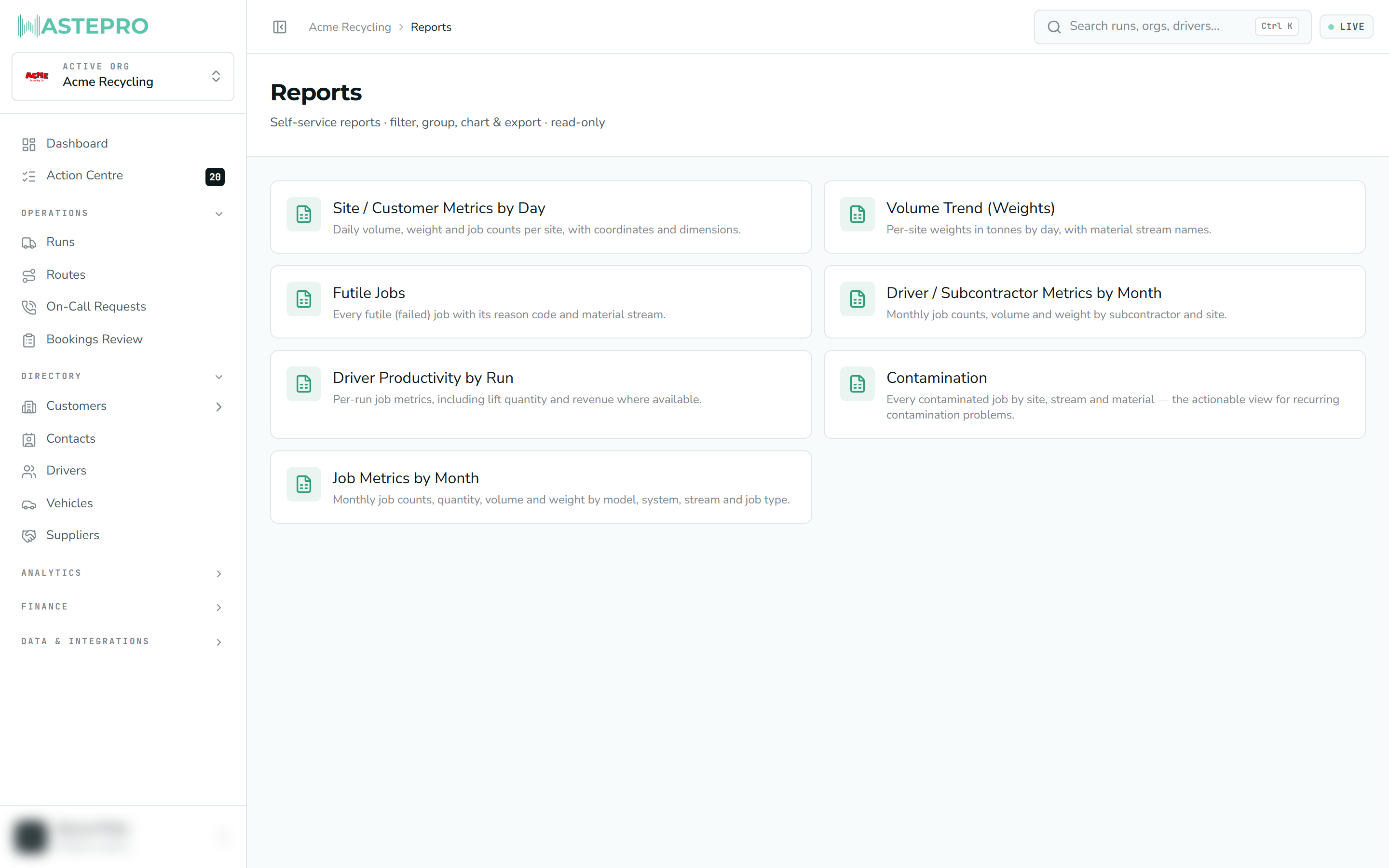
There’s also a Reports hub at /reports showing a card per report with a one-line
description. It isn’t on the menu any more, but it’s a useful index if you’re browsing —
and the All reports link at the top of any report takes you back to it.
The date range
Every report is bound to a date range, shown as two date boxes (from → to) near the top. Each report opens on a sensible default — roughly a month for the day-by-day reports, and up to a year for the ones that summarise by month — and you change it by picking new dates. The report re-reads your data as soon as you do.
Three ways to view the same data
A row of buttons lets you switch how the same figures are presented. The underlying data doesn’t change — only the shape does.
| View | What it shows | Good for |
|---|---|---|
| Table | Every detail row, column by column | Reading the raw detail, exporting |
| Chart | A bar or line chart of one measure | Spotting trends and big contributors |
| Pivot | A grid with one thing down the side and another across the top | Cross-tabulating, e.g. site by month |
Grouping and measuring
When you’re in Chart or Pivot, a few dropdowns appear:
- Group by — the thing you’re breaking the numbers down by (customer, site, stream, reason, date, and so on).
- Measure — the number you’re looking at (jobs, weight, volume, revenue — it depends on the report).
- By (day / week / month / quarter) — appears only when you group by date, and sets how finely the time axis is bucketed.
In Pivot you choose a Rows and a Columns dimension instead of a single group-by, and the measure fills the cells.
The KPI strip
Across the top of every report is a row of headline totals for the current date range — the report’s key measures, each with an up-or-down change against the previous period (the same length of time immediately before your range). This lets you see at a glance whether a number is rising or falling.
The KPI totals are exact — they’re worked out across all your matching data, even when the detail table below only shows a sample (see the cap note further down). So trust the big numbers at the top even if the table looks trimmed.
Saved views
Once you’ve set up a report the way you like — a date range, a grouping, a chart — you can keep it with Saved views:
Save the current setup
Open Saved views, give it a name, and add it. It remembers the current filters, grouping and view mode.
Reload it any time
Pick it from the list to jump straight back to that exact setup.
Share it, or keep it private
Your own views are private by default. You can share one with your team so everyone sees the same view, or make it private again. You can delete the views you created.
Saving and sharing views may be switched off for some accounts or roles. If you don’t see the option to add a view, you can still open any views your team has shared.
Exporting
Every view can be exported. In Table and Pivot there’s an Export CSV button; charts and maps have a Download CSV button. The file is named after the report and the date, and opens straight into Excel or Google Sheets.
One thing to watch: very large ranges
To stay fast, the detail table and charts show the most recent 10,000 rows of a range. If a report tells you it’s showing a sample, that only affects the detail list — the KPI totals at the top are still exact and complete.
If you need every single detail row (not just the totals) and a report says it’s capped, narrow the date range until the cap notice disappears. Then the table holds every matching row.
Next: see these controls in action on Driver Productivity, or build your own report from scratch with the Report Builder.